

Introduction: The Evolution of Paint Color Trends in 2026
As we move into 2026, the world of interior design is experiencing a significant shift in how homeowners approach color. Gone are the days of playing it safe with neutral beiges and safe grays. Instead, 2026 paint color trends reflect a deeper desire for authenticity, connection to nature, and personal expression through color.
The paint color trends for 2026 represent more than just aesthetic preferences—they reflect broader cultural movements toward sustainability, wellness, and individualism. Homeowners are increasingly choosing colors that create emotional connections to their spaces, support their mental health, and express their unique personalities.
Whether you’re planning a complete home refresh or simply updating a single room, understanding the paint color trends for 2026 will help you make choices that feel both current and timeless. This comprehensive guide explores the hottest paint colors, color palettes, and design trends that are defining 2026.
The Psychology Behind 2026 Paint Color Trends
Before diving into specific colors, it’s important to understand why certain colors are trending in 2026. Paint color trends don’t emerge randomly—they reflect what’s happening in the world, what people are feeling, and what they value.
Connection to Nature
One of the most significant influences on 2026 paint color trends is a renewed focus on connection to the natural world. After years of urban living and digital saturation, people are craving colors that remind them of nature—earthy tones, botanical greens, and warm, organic hues.
This trend reflects a broader movement toward biophilic design, which incorporates natural elements into interior spaces to improve well-being, reduce stress, and create a sense of calm.
Wellness and Mental Health
Color psychology plays a crucial role in 2026 paint color trends. Homeowners are increasingly aware of how colors affect mood, energy levels, and overall well-being. This has led to a preference for colors that promote relaxation, focus, and positive emotions.
Warm, muted tones are trending because they create a sense of comfort and safety. Cool, saturated colors are popular in workspaces because they promote focus and creativity.
Authenticity and Personalization
Another major influence on 2026 paint color trends is the desire for authenticity. Rather than following trends blindly, homeowners are choosing colors that genuinely reflect their personalities and lifestyles. This has led to greater diversity in color choices and a move away from one-size-fits-all design trends.
Sustainability Consciousness
Finally, 2026 paint color trends reflect growing environmental consciousness. People are choosing colors that work with natural light, reducing the need for artificial lighting. They’re also selecting eco-friendly paints and finishes that minimize environmental impact.
Top 10 Paint Color Trends for 2026
1. Deep, Saturated Greens
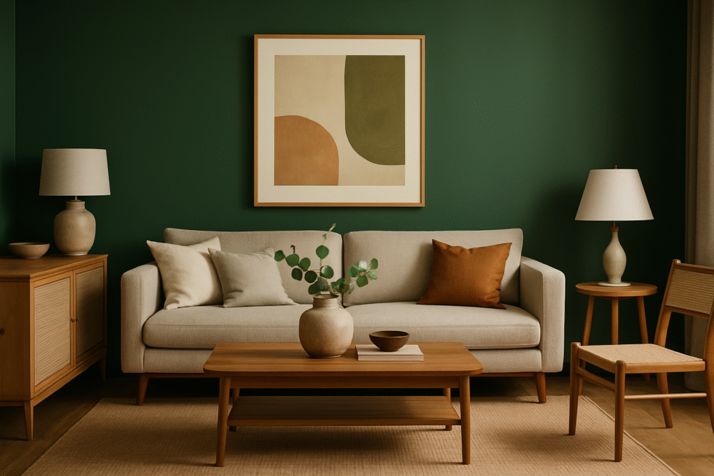
Why It’s Trending: Deep greens are the color of 2026. From forest green to hunter green to olive, rich green tones are appearing on walls, trim, and ceilings across the country.
Why It Works: Green is inherently calming and connects us to nature. Deep, saturated greens create a sense of sophistication and luxury while promoting relaxation and focus.
Best For: Living rooms, bedrooms, home offices, and accent walls. Deep greens work particularly well in rooms with natural light.
Color Recommendations:
- Forest Green: A classic, timeless choice that works with both traditional and modern decor
- Hunter Green: Slightly more muted than forest green, creating a sophisticated, elegant feel
- Olive Green: A warmer, more earthy green that pairs beautifully with natural wood tones
- Sage Green: A softer, more muted green that creates a calming, spa-like atmosphere
Design Tip: Pair deep greens with warm neutrals (cream, taupe, warm white) and natural materials (wood, stone, linen) for a balanced, sophisticated look.
2. Warm, Earthy Browns
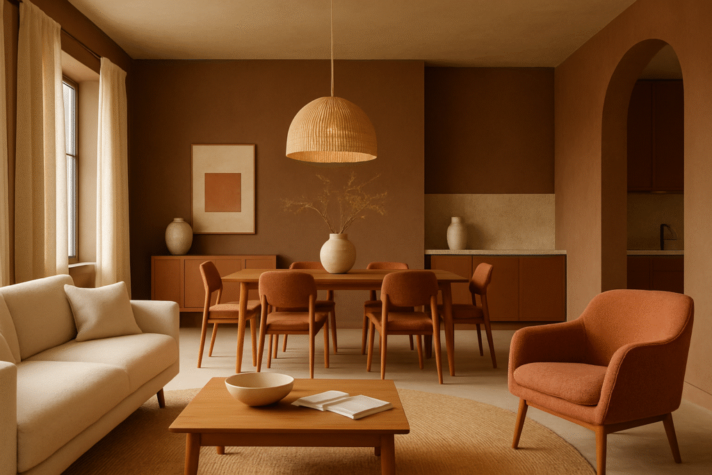
Why It’s Trending: Brown is having a major moment in 2026. From warm chocolate to rich terracotta to soft taupe, earthy brown tones are replacing cool grays as the go-to neutral.
Why It Works: Warm browns create a sense of warmth, comfort, and groundedness. They’re less sterile than gray and more forgiving of imperfections in lighting and wall texture.
Best For: Living rooms, bedrooms, dining rooms, and hallways. Warm browns work well as a base color for entire homes.
Color Recommendations:
- Chocolate Brown: A rich, luxurious brown that creates drama and sophistication
- Terracotta: A warm, earthy orange-brown that brings energy and warmth
- Taupe: A soft, muted brown that works as a neutral base
- Warm Greige: A blend of gray and beige with warm undertones
Design Tip: Warm browns pair beautifully with warm whites, creams, and natural wood tones. They also work well with jewel tones and muted accent colors.
3. Muted, Saturated Blues
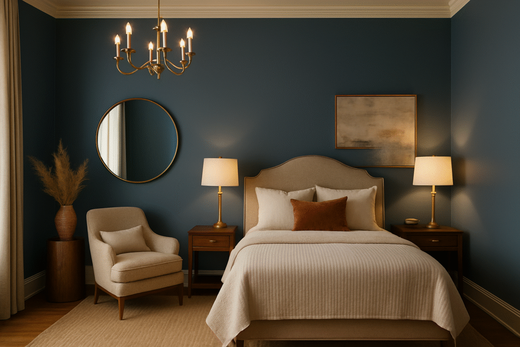
Why It’s Trending: Blue is transitioning from pale, washed-out tones to deeper, more saturated hues. Muted blues—not bright or neon, but rich and sophisticated—are trending in 2026.
Why It Works: Blue promotes calmness, focus, and productivity. Saturated blues feel more intentional and sophisticated than pale blues, creating a sense of depth and luxury.
Best For: Bedrooms, home offices, bathrooms, and accent walls. Muted blues work well in rooms where you want to promote relaxation or focus.
Color Recommendations:
- Navy Blue: A classic, versatile color that works with nearly any decor style
- Slate Blue: A muted, sophisticated blue with gray undertones
- Teal: A blue-green hybrid that’s both calming and energizing
- Dusty Blue: A softer, more muted blue that creates a serene atmosphere
Design Tip: Muted blues pair well with warm neutrals, brass or gold accents, and natural textures. They also work beautifully with white trim for a classic look.
4. Warm, Spiced Terracotta and Rust Tones
Why It’s Trending: Warm, earthy orange-based tones are trending in 2026. Terracotta, rust, and warm ochre bring energy, warmth, and a connection to the earth.
Why It Works: These warm tones create a sense of comfort, creativity, and energy. They’re particularly popular in kitchens, dining rooms, and creative spaces.
Best For: Kitchens, dining rooms, creative spaces, accent walls, and entryways. Terracotta and rust tones work well in rooms where you want to create energy and warmth.
Color Recommendations:
- Terracotta: A warm, earthy orange-brown that brings Mediterranean vibes
- Rust: A deeper, more muted orange-brown that feels sophisticated and grounded
- Warm Ochre: A golden, earthy tone that’s both warm and sophisticated
- Burnt Orange: A deeper, more saturated orange that creates drama and energy
Design Tip: Pair warm terracotta and rust tones with cream, warm white, or soft gray. They work beautifully with natural wood, woven textures, and earth-toned accents.
5. Soft, Muted Mauve and Plum Tones
Why It’s Trending: Soft, muted purples—mauve, plum, and lavender—are making a comeback in 2026. These sophisticated tones are more subtle than the bold purples of previous years.
Why It Works: Muted purples create a sense of creativity, luxury, and calm. They’re sophisticated without being overwhelming, making them perfect for homeowners who want to add color without too much drama.
Best For: Bedrooms, bathrooms, creative spaces, and accent walls. Soft purples work well in rooms where you want to create a sense of calm creativity.
Color Recommendations:
- Mauve: A soft, muted purple with gray undertones
- Dusty Plum: A deeper, more sophisticated purple
- Soft Lavender: A gentle, calming purple
- Heather: A muted purple with blue undertones
Design Tip: Pair soft purples with warm neutrals, soft whites, and natural textures. They work beautifully with brass accents and vintage or eclectic decor.
6. Creamy, Warm Whites and Off-Whites
Why It’s Trending: While white might seem timeless, 2026 is seeing a shift toward warmer, creamier whites with subtle undertones rather than stark, cool whites.
Why It Works: Warm whites create a sense of comfort and coziness while maintaining the brightness and openness of white. They’re more forgiving than cool whites and work better with warm-toned decor.
Best For: Trim, ceilings, and walls in homes with warm-toned furniture and decor. Warm whites work well as a base color throughout a home.
Color Recommendations:
- Cream: A soft, warm white with yellow undertones
- Ivory: A warm white with subtle beige undertones
- Linen: A soft, warm white that feels cozy and inviting
- Warm White: A white with subtle warm undertones
Design Tip: Pair warm whites with warm neutrals, natural wood, and warm-toned accents. They create a cohesive, warm aesthetic throughout a home.
7. Bold, Statement Jewel Tones
Why It’s Trending: While most 2026 trends lean toward muted, saturated colors, bold jewel tones—emerald, sapphire, amethyst—are trending for accent walls and creative spaces.
Why It Works: Jewel tones create drama, luxury, and sophistication. They’re bold enough to make a statement but sophisticated enough to feel intentional rather than trendy.
Best For: Accent walls, powder rooms, home offices, and creative spaces. Jewel tones work well in rooms where you want to create drama and visual interest.
Color Recommendations:
- Emerald Green: A rich, luxurious green
- Sapphire Blue: A deep, sophisticated blue
- Amethyst Purple: A rich, regal purple
- Deep Teal: A bold, sophisticated blue-green
Design Tip: Use jewel tones on a single accent wall or in small spaces. Pair with warm neutrals and metallic accents for a luxurious feel.
8. Warm, Muted Grays with Undertones
Why It’s Trending: While cool grays are falling out of favor, warm grays with subtle undertones are still popular in 2026. These grays have warmth and personality rather than feeling sterile.
Why It Works: Warm grays provide a neutral base while adding subtle color and warmth. They work well with both warm and cool-toned decor.
Best For: Living rooms, bedrooms, hallways, and trim. Warm grays work well as a neutral base throughout a home.
Color Recommendations:
- Greige: A blend of gray and beige with warm undertones
- Warm Gray: A gray with subtle warm undertones
- Taupe: A gray-brown blend that’s warm and sophisticated
- Greyed Sage: A muted green-gray hybrid
Design Tip: Pair warm grays with warm whites, natural wood, and warm-toned accents. They work well with both traditional and modern decor.
9. Soft, Muted Blush and Warm Pink Tones
Why It’s Trending: Soft, muted pinks—blush, dusty rose, and warm mauve-pink—are trending in 2026. These sophisticated tones are far from the bright pinks of previous years.
Why It Works: Soft pinks create a sense of warmth, comfort, and femininity without being overly sweet or childish. They’re sophisticated and work well in modern interiors.
Best For: Bedrooms, bathrooms, nurseries, and accent walls. Soft pinks work well in rooms where you want to create a sense of warmth and comfort.
Color Recommendations:
- Blush: A soft, muted pink with gray undertones
- Dusty Rose: A deeper, more sophisticated pink
- Warm Mauve-Pink: A pink with purple undertones
- Pale Terracotta-Pink: A warm, earthy pink
Design Tip: Pair soft pinks with warm whites, creams, and natural textures. They work beautifully with brass accents and vintage or eclectic decor.
10. Deep, Moody Charcoal and Warm Black
Why It’s Trending: Deep, moody colors—charcoal and warm black—are trending for accent walls, trim, and ceilings in 2026. These bold, dramatic colors create sophistication and depth.
Why It Works: Deep charcoal and black create drama, sophistication, and visual interest. They work well in modern, eclectic, and traditional spaces.
Best For: Accent walls, trim, ceilings, and feature walls. Deep charcoal and black work well in rooms where you want to create drama and visual interest.
Color Recommendations:
- Charcoal: A deep gray-black that’s sophisticated and moody
- Warm Black: A black with subtle warm undertones
- Deep Navy-Black: A black with blue undertones
- Graphite: A dark gray that’s less intense than black
Design Tip: Use deep, moody colors on a single wall or on trim and ceilings. Pair with warm neutrals and metallic accents for a balanced, sophisticated look.
2026 Paint Color Palettes: Complete Combinations
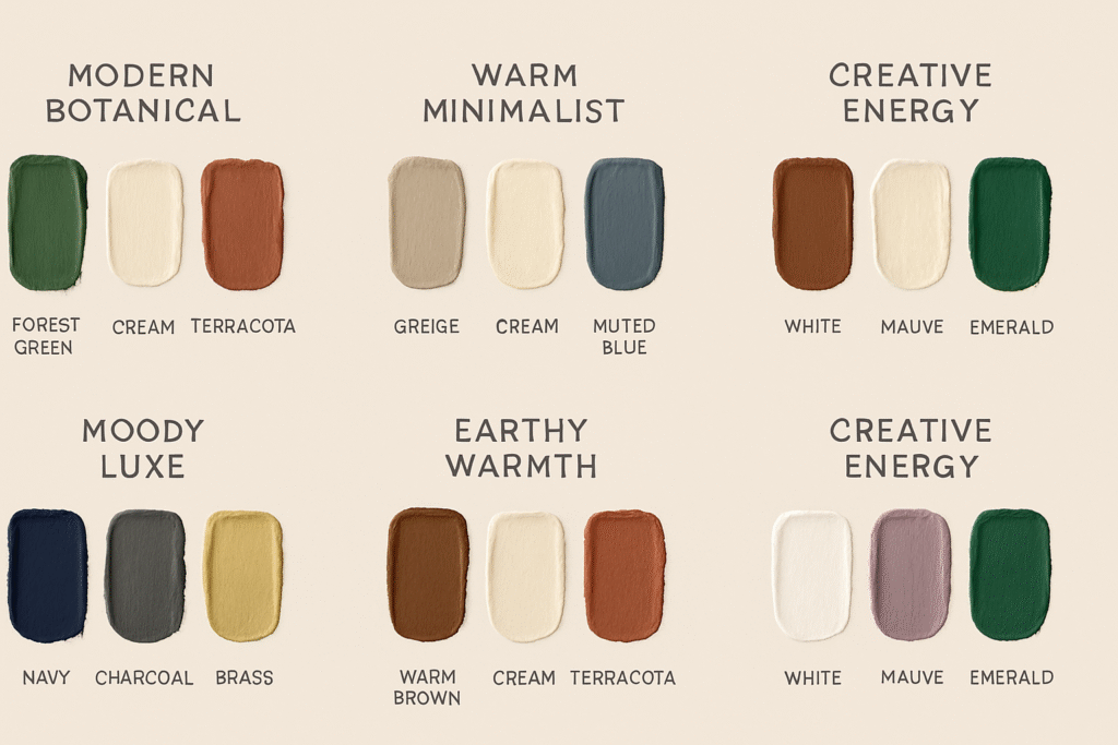
Rather than choosing colors in isolation, the best approach is to think about how colors work together. Here are some popular 2026 paint color palettes:
Palette 1: Modern Botanical
- Primary: Deep Forest Green
- Secondary: Warm Cream
- Accent: Terracotta
- Trim: Warm White
This palette creates a sophisticated, nature-inspired aesthetic that’s both modern and timeless.
Palette 2: Warm Minimalist
- Primary: Warm Greige
- Secondary: Cream
- Accent: Muted Blue
- Trim: Warm White
This palette creates a calm, sophisticated aesthetic with subtle color and warmth.
Palette 3: Moody Luxe
- Primary: Deep Navy Blue
- Secondary: Charcoal
- Accent: Brass/Gold
- Trim: Warm White
This palette creates a dramatic, luxurious aesthetic that’s sophisticated and bold.
Palette 4: Earthy Warmth
- Primary: Warm Brown/Taupe
- Secondary: Warm Cream
- Accent: Muted Terracotta
- Trim: Warm White
This palette creates a warm, grounded aesthetic that’s inviting and comfortable.
Palette 5: Creative Energy
- Primary: Warm White
- Secondary: Soft Mauve
- Accent: Emerald Green
- Trim: Warm White
This palette creates a creative, energetic aesthetic that’s sophisticated and playful.
Paint Finishes Trending in 2026
Beyond color, the finish you choose is equally important. Here are the paint finishes trending in 2026:
Matte Finishes
Matte finishes continue to dominate in 2026. They provide a sophisticated, modern look and help hide wall imperfections. Matte finishes are perfect for living rooms, bedrooms, and any room where you want a soft, elegant appearance.
Best For: Living rooms, bedrooms, dining rooms, accent walls
Pros: Sophisticated look, hides imperfections, reduces glare Cons: Less durable, harder to clean
Eggshell Finishes
Eggshell finishes offer a subtle sheen that’s more durable than matte while maintaining a sophisticated appearance. They’re becoming increasingly popular in 2026 for their balance of aesthetics and practicality.
Best For: Hallways, bedrooms, living rooms, anywhere you want durability with a soft look
Pros: Subtle sheen, more durable than matte, easier to clean Cons: Shows brush strokes more than matte
Satin Finishes
Satin finishes are trending in kitchens, bathrooms, and other high-moisture areas. They’re durable, easy to clean, and provide a soft sheen that’s more sophisticated than semi-gloss.
Best For: Kitchens, bathrooms, trim, high-traffic areas
Pros: Durable, easy to clean, soft sheen Cons: Shows imperfections more than matte
Textured Finishes
Textured finishes—including limewash, plaster, and other specialty finishes—are trending in 2026. These finishes add depth, character, and visual interest to walls.
Best For: Accent walls, feature walls, rooms where you want visual interest
Pros: Adds depth and character, hides imperfections, unique appearance Cons: More difficult to apply, harder to touch up
How to Choose the Right Paint Color for Your Home
With so many trending colors to choose from, how do you select the right one for your space? Here are some tips:
Consider Your Lighting
Lighting dramatically affects how colors appear. Natural light, warm artificial light, and cool artificial light all make colors look different. Before committing to a color, test paint samples in your space under different lighting conditions.
Think About Your Existing Decor
Your paint color should complement your existing furniture, flooring, and decor. Consider the undertones in your existing pieces and choose a paint color that harmonizes with them.
Consider the Room’s Purpose
Different rooms serve different purposes and benefit from different colors. Bedrooms might benefit from calming colors like soft blues or greens, while kitchens might benefit from energizing colors like warm terracotta or soft mauve.
Test Before Committing
Always test paint colors before committing to a full room. Paint large swatches on your walls and live with them for a few days. Observe how they look at different times of day and under different lighting conditions.
Consider Your Personal Style
Ultimately, choose colors that resonate with you personally. Your home should reflect your personality and make you feel comfortable and happy.
Think Long-Term
While it’s fun to follow trends, consider whether a color will feel timeless to you. The best paint colors are ones that you’ll love for years to come, not just for the current season.
Paint Color Trends by Room
Different rooms benefit from different colors. Here’s a guide to 2026 paint color trends by room:
Bedrooms
Trending Colors: Soft blues, muted greens, soft mauve, warm creams
Why: Bedrooms should promote relaxation and sleep. Soft, muted colors create a calming atmosphere.
Recommendations: Soft blue, sage green, dusty mauve, or warm cream
Living Rooms
Trending Colors: Deep greens, warm browns, muted blues, warm grays
Why: Living rooms are gathering spaces that should feel inviting and sophisticated. Deeper, more saturated colors create a sense of luxury and comfort.
Recommendations: Forest green, warm taupe, navy blue, or warm greige
Kitchens
Trending Colors: Warm terracotta, soft mauve, warm cream, deep green
Why: Kitchens are active spaces that benefit from colors that energize and inspire. Warm, earthy tones create a sense of comfort and creativity.
Recommendations: Warm terracotta, soft mauve, warm cream, or forest green
Bathrooms
Trending Colors: Soft blues, muted greens, warm creams, soft mauve
Why: Bathrooms are spa-like spaces that benefit from calming, sophisticated colors.
Recommendations: Soft blue, sage green, warm cream, or dusty mauve
Home Offices
Trending Colors: Muted blues, soft greens, warm grays, warm creams
Why: Home offices should promote focus and productivity. Soft, sophisticated colors create a professional atmosphere without being sterile.
Recommendations: Muted blue, soft green, warm gray, or warm cream
Entryways and Hallways
Trending Colors: Warm creams, warm grays, deep greens, warm browns
Why: Entryways and hallways set the tone for your home. Sophisticated, welcoming colors create a positive first impression.
Recommendations: Warm cream, warm gray, forest green, or warm taupe
Eco-Friendly Paint Options for 2026
As environmental consciousness continues to grow, eco-friendly paint options are becoming increasingly important. Here are some options to consider:
Low-VOC Paints
Low-VOC (volatile organic compound) paints emit fewer harmful chemicals than traditional paints. They’re better for your health and the environment.
Zero-VOC Paints
Zero-VOC paints emit virtually no harmful chemicals. They’re the most environmentally friendly option and are becoming increasingly available in a wide range of colors.
Natural and Organic Paints
Natural and organic paints are made from renewable resources and are biodegradable. They’re a great option if you want to minimize your environmental impact.
Recycled Paint
Some companies collect and recycle leftover paint, offering it at a reduced price. This is a great way to save money while reducing waste.
2026 Paint Color Trends: Professional Tips
Here are some professional tips for working with 2026 paint color trends:
Invest in Quality Paint
Quality paint goes further, covers better, and lasts longer than budget paint. Investing in quality paint is worth the extra cost.
Use Professional Application
Professional painters have the skills and experience to apply paint flawlessly. They know how to prepare surfaces, apply paint evenly, and create clean edges.
Consider Professional Color Consultation
If you’re unsure about color choices, consider hiring a professional color consultant. They can help you choose colors that work with your space, lighting, and existing decor.
Don’t Underestimate Accent Walls
Accent walls are a great way to add color and visual interest without committing to a full room. They’re also a way to test a color before painting an entire room.
Invest in Good Trim
Your trim color is just as important as your wall color. Warm whites and soft creams are trending for trim in 2026.
Conclusion: Embracing 2026 Paint Color Trends
The paint color trends for 2026 reflect a broader shift toward authenticity, connection to nature, and personal expression. Whether you choose a deep forest green, warm terracotta, muted blue, or any of the other trending colors, the key is to choose colors that resonate with you and create a space where you feel comfortable and happy.
Remember, the best paint color is one that you’ll love for years to come. Don’t be afraid to test colors, ask for professional advice, and choose colors that reflect your personality and style.
If you’re ready to transform your home with 2026 paint color trends, consider working with a professional interior painter who understands current design trends and can help you achieve the look you want.
Ready to Update Your Home’s Colors?
If you’re inspired by the 2026 paint color trends and ready to transform your home, Boston Paint & Power is here to help. Our professional painters understand the latest color trends and can help you choose and apply the perfect colors for your space.
Whether you’re looking for a complete home refresh or simply updating a single room, we’ll work with you to understand your vision and bring it to life with expert craftsmanship and attention to detail.
Contact us today for a free color consultation and estimate. Let’s transform your home with the hottest paint colors of 2026.
🌐 https://lp.bostonpaintandpower.com/
📩 bostonpaintandpower@gmail.com
📞 Call 617 283 3617